Google Summer of Code 2021 - Dask Project
By Freyam Mehta and Genevieve Buckley
Overview
Here’s an update on new features related to visualizing Dask graphs and HTML representations. You can try these new features today with version 2021.08.1 or above. This work was done by Freyam Mehta during the Google Summer of Code 2021. Dask took part in the program under the NumFOCUS umbrella organization.
Contents
Visualizing Dask graphs
There are several new features involving Dask task graph visualization. Task graphs are a visual representation of the order and dependencies of each individual task within a dask computation. They are a very userful diagnostic tool, and have been used for a long time.

Freyam worked on making these visualizations more illustrative, engaging, and informative. The Graphviz library boasts a great set of attributes which can be modifified to create a more visually appealing output.
These features primarily improve the Dask high level graph visualizations. Both low level and high level Dask graphs can be accessed with very similar methods:
- Dask low level graph:
result.visualize() - Dask high level graph:
result.dask.visualize()
…where result is a dask object or collection.
Graphviz node size scaling
The first change you may notice to the Dask high level graphs, is that the node sizes have been adjusted to scale with the number of tasks in each layer. Layers with more tasks would appear larger than the rest.
This is a helpful feature to have, because now users can get a much more intuitive sense of where the bulk of their computation takes place.
Example:
import dask.array as da

array = da.random.random((10000, 10000), chunks=(200, 200))
result = array + array.T - array.mean(axis=0)

result.dask.visualize()  # Dask high level graph
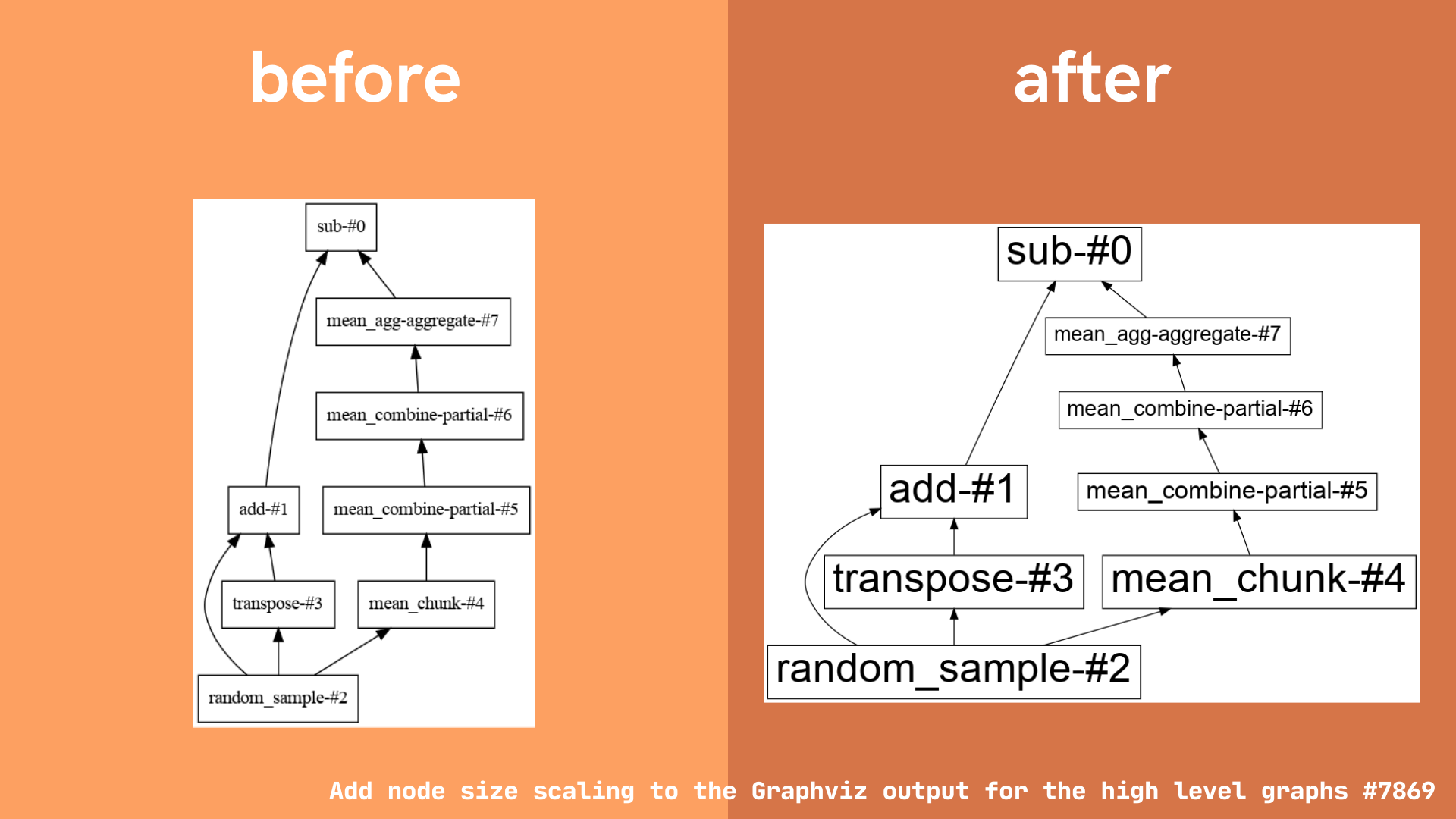
Note: this change only affects the graphviz output for Dask high level graphs. Low level graphs are left unchanged, because each visual node corresponds to one task.
New tooltips
Dask high level graphs now include hover tooltips to provide a brief summary of more detailed information. To use the tooltips, generate a dask high level graph (eg: result.dask.visualize()) then hover your mouse above the layer you are interested in.
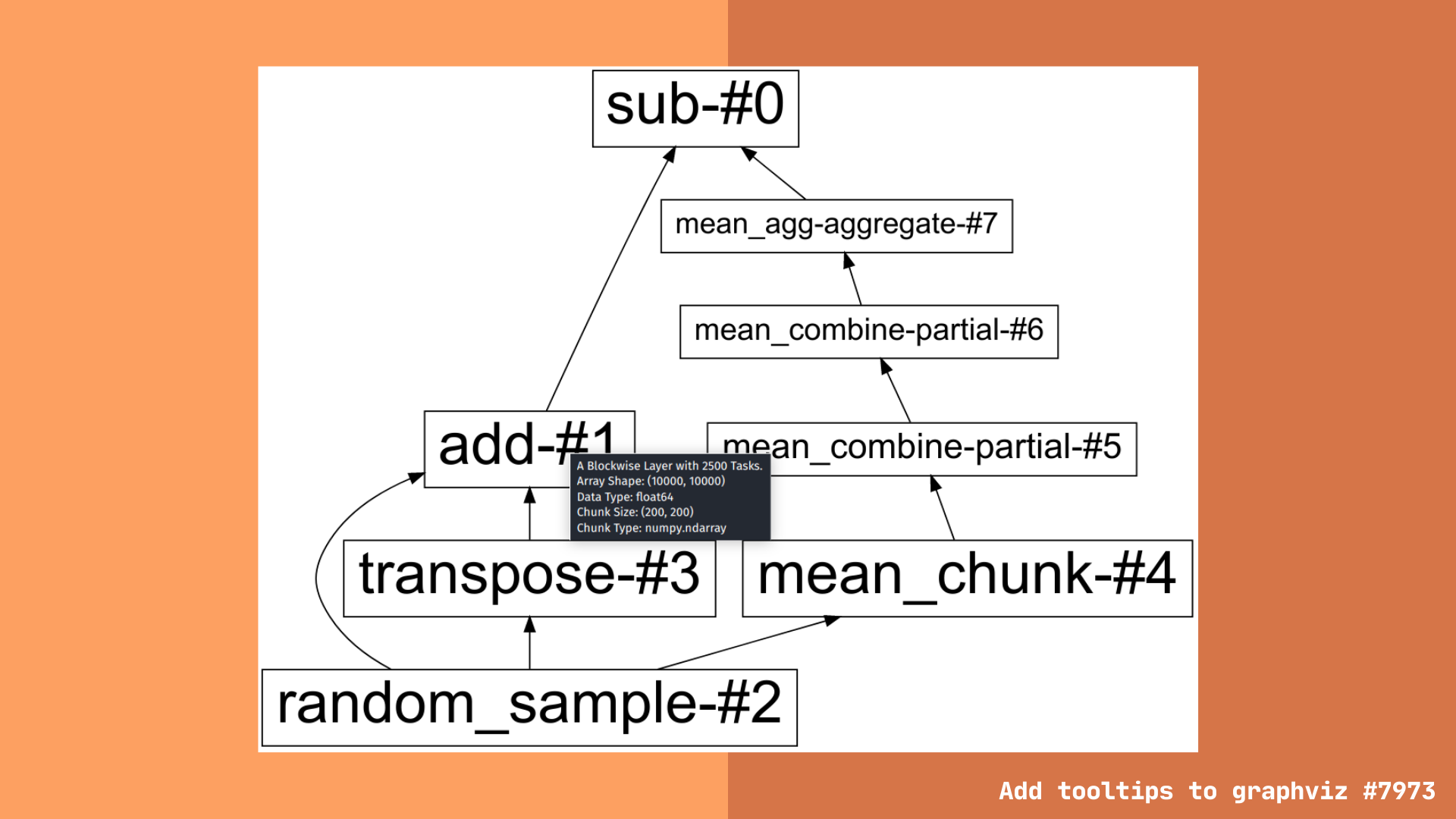
Tooltips provide information such as the layer type and number of tasks associated with it. There is additional information provided for specific dask collections, like dask arrays and dataframes.
Dask array tooltip information additionally includes:
- Array shape
- Chunk size
- Chunk type (eg: are the array chunks numpy, cupy, sparse, etc.)
- Data type (eg: are the array values float, integer, boolean, etc.)
Dask dataframe tooltip information additionally includes:
- Number of partitions
- Dataframe type
- Dataframe columns
Users have asked for a less overwhelming view into the dask task graph. We hope the high level graph view coupled with more detailed tooltip information can provide this middle ground, with enough information to be useful, but not so much as to become overwhelming (like the low level task graphs for large computations).
Note: This feature is available for SVG output. Other image formats, like .png, etc. do not support tooltips.
Reference: Pull request #7973 by Freyam Mehta “Add tooltips to graphviz”
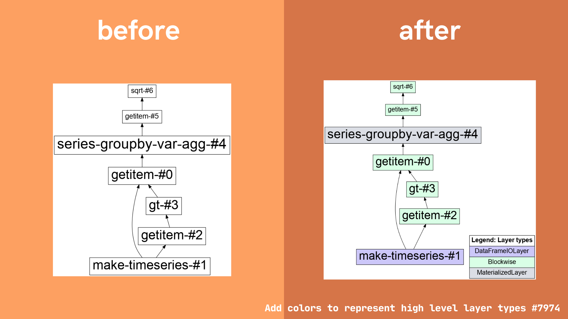
Color by layer type
There is also a new feature enabling users to color code a high level graph according to layer type. This option can be enabled by passing the color="layer_type" keyword argument, eg: result.dask.visualize(color="layer_type"). This change is intended to make it easier for users to see which layer types predominate.
While there are no hard and fast rules about what makes a Dask computation efficient, there are some general guidelines:
- Dataframe shuffles are particularly expensive operations. You can read more about this here.
- Reading and writing data to/from storage/network services is often high-latency and therefore a bottleneck.
- Blockwise layers are generally efficient for computation.
- All layers are materialized during computation.
See the Dask best pracices pages for more information on creating more efficient Dask computations.
Example:
import dask
import dask.dataframe as dd

df = dask.datasets.timeseries()
df2 = df[df.y > 0]
df3 = df2.groupby('name').x.std()

df3.dask.visualize(color="layer_type")  # Dask high level graph with colored nodes by layer type
Reference: Pull request #7974 by Freyam Mehta “Add colors to represent high level layer types”
Bugfix in visualize method
Freyam also fixed a bug which caused an error when users tried to call dask.visualize() with filename=None (issue #7685, fixed by pull request #7740).
The bug was fixed by adding an extra condition before it reaches the error. If the format is None, Dask now uses use a default png format.
import dask
import dask.array as da

array = da.arange(10)
dask.visualize(array, filename=None)  # success
Reference: Pull request #7740 by Freyam Mehta “Fixing calling .visualize() with filename=None”
HTML representations
Dask makes use of HTML representations in several places, for example in Dask collections like the Array and Dataframe classes (for background reading, see this blogpost).
More recently, we’ve introduced HTML representations for high level graphs into Dask, and Jacob Tomlinson has implemented HTML representations in several places in the dask distributed library (for further reading, see this other blogpost).
During Freyam’s Google Summer of Code project, he extended the HTML representations for Dask high level graphs to include images, and introduced two entirely new HTML representations to the dask distributed library.
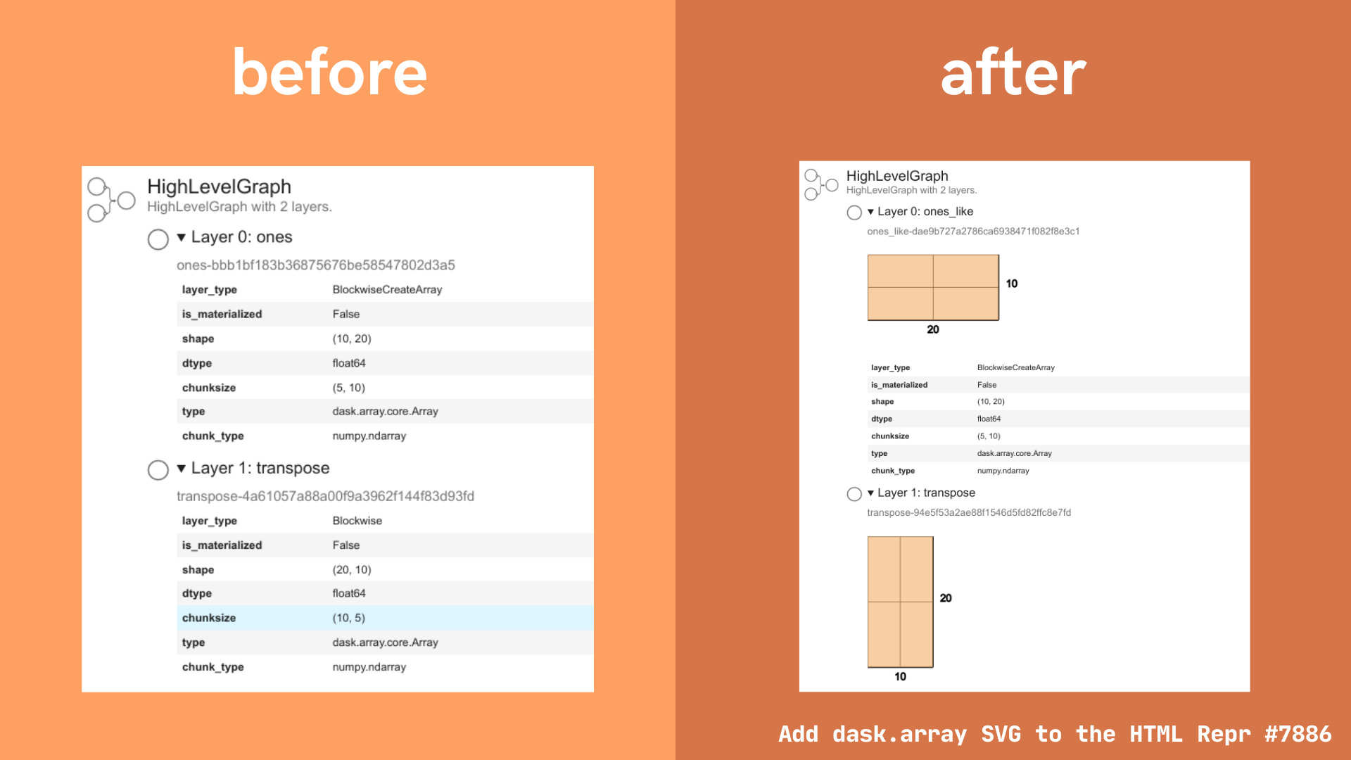
Array images in HTML repr for high level graphs
The HTML representation for dask high level graphs has been extended, and now includes SVG images of dask arrays at intermediate stages of computation.
The motivation for this feature is similar to the motivation behind adding tooltips, discussed above. Users want easier ways to access information about the way a Dask computation changes as it moves through each stage of computation. We hope this improvement to the HTML representation for Dask high level graphs will provide an at a glance summary of array shape and chunk size at each stage.
Example:
import dask.array as da

array = da.ones((10, 20), chunks=(5, 10))
array = array.T

array.dask  # shows the HTML representation in Jupyter
Reference: Pull request #7886 by Freyam Mehta “Add dask.array SVG to the HTML Repr”
New HTML repr for ProcessInterface class
A new HTML representation has been created for the ProcessInterface class in dask distributed.
The HTML representation displays the status, address, and external address of the process.
There are three possible status options:
- Process created, not yet running (blue icon)
- Process is running (green icon)
- Process closed (orange icon)
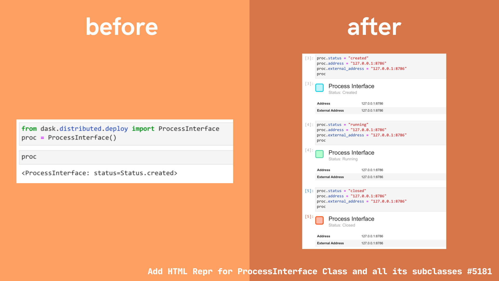
The ProcessInterface class is not intended to be used directly. Instead, more typically this information will be accessed via subclasses such as the SSH scheduler or workers.
Example:
from dask.distributed import LocalCluster, Client, SSHCluster

cluster = SSHCluster(["127.0.0.1", "127.0.0.1", "127.0.0.1"])
cluster.scheduler  # HTML representation for the SSH scheduler, shown in Jupyter
cluster.workers  # dict of all the workers
# or
cluster.workers[0]  # HTML representation for the first SSH worker in the cluster
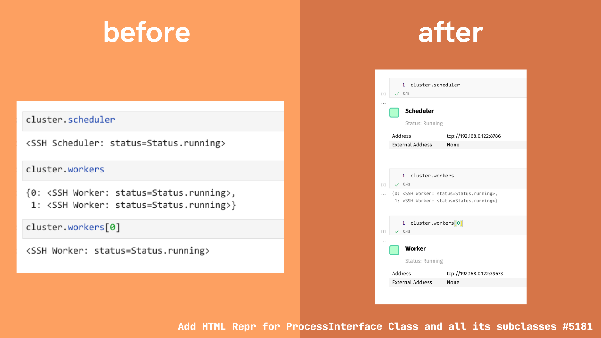
Reference: Pull request #5181 by Freyam Mehta “Add HTML Repr for ProcessInterface Class and all its subclasses”
New HTML repr for Security class
Pull request #5178 added a new HTML representation for the Security class in the dask distributed library.
The Security HTML representation shows:
- Whether encryption is required
- Whether the object instance was created using
Security.temporary()orSecurity(**paths_to_keys).- For temporary security objects, keys are generated dynamically and the only copy is kept in memory.
- For security objects created using keys stored on disk, the HTML representation will show the full filepath to the relevant security certificates on disk.
Example: temporary security object
from dask.distributed import Security

s = Security.temporary()
s  # shows the HTML representation in Jupyter
Example: security object using certificates saved to disk
from dask.distributed import Security

s = Security(require_encryption=True, tls_ca_file="ca.pem", tls_scheduler_cert="scert.pem")
s  # shows the HTML representation in Jupyter
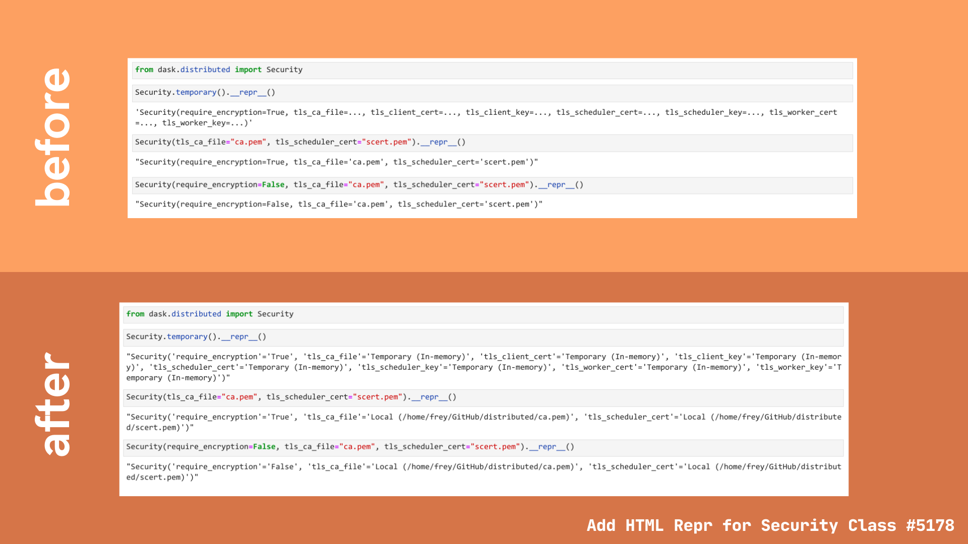
In addition, the text representation has also been updated to reflect the same information shown in the HTML representation.
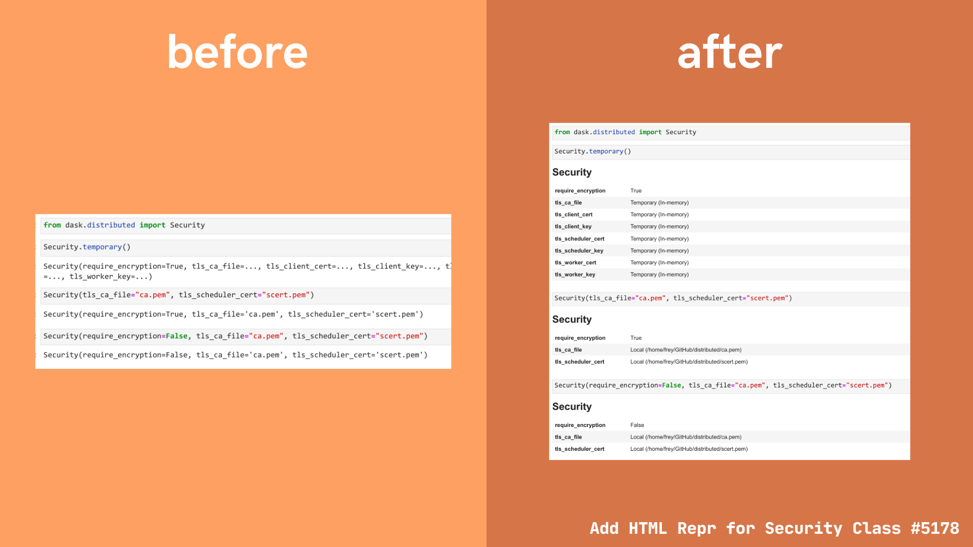
Reference: Pull request #5178 by Freyam Mehta “Add HTML Repr for Security Class”
blog comments powered by Disqus